A well-organized office environment depends on clear and concise data presentation. When performance metrics are displayed in a centralized location such as an office TV dashboard, everyone from team members to executives gains immediate insight into the organization’s progress. Excel dashboards offer flexibility and power when it comes to tracking key performance indicators (KPIs). In this guide, we explore the top 10 KPIs every office should consider featuring on their TV dashboards, provide tips on selecting the most relevant KPIs, describe various visualization types, and explain how these insights can drive better decision-making.
The Importance of Office KPI Dashboards
Office KPI dashboards serve as a central hub for performance monitoring. They bring data to life by making trends visible, flagging areas that need attention, and celebrating successes. When employees and management can see key figures updated in real-time, they are better equipped to respond quickly to market changes or internal process improvements.
Displaying metrics on TV screens creates an environment where performance is transparent and accessible. Whether it is a sales team tracking revenue or an operations manager monitoring project progress, everyone benefits from having the same data at their fingertips. Excel KPI displays are particularly effective because they allow users to customize data, create interactive charts, and integrate data from multiple sources.
Explore Microsoft Excel Integration Features - Click here
Selecting the Right KPIs for Your Office
Understand Your Business Objectives
Before choosing which KPIs to feature on your office TV dashboard, it is essential to identify your core business objectives. Each KPI should reflect a strategic goal. For example, if your primary aim is to increase revenue, then metrics related to sales and conversion rates become a priority.
- Strategic Alignment: Ensure that each indicator aligns with overall company goals.
- Actionability: Choose KPIs that can guide decision making and prompt action.
- Relevance: Only include metrics that provide direct insights into performance areas critical to your success.
Data Availability and Quality
Reliable data is the cornerstone of effective dashboards. Evaluate the availability of data, the frequency of updates, and its accuracy. Poor-quality data can lead to misinterpretation and misguided decisions. Consider:
- Data Sources: Where does the data come from? Can it be easily integrated into your Excel dashboard?
- Timeliness: How often is the data refreshed? Real-time data is ideal for daily operations.
- Consistency: Ensure that data from different departments follows the same standards and definitions.
Customization and User Needs
Different departments may have different informational needs. While executives might need high-level summaries, managers often require a more granular view. A flexible Excel KPI display can offer both:
- User-Centric Design: Customize dashboards to suit the specific requirements of different roles.
- Scalability: As your business grows, ensure that your KPI selection can evolve to include additional metrics.
- Interactivity: Allow users to drill down into data for a more detailed analysis when needed.
The 10 Essential KPIs to Feature on Your Office TV Excel Dashboards
Below is a detailed explanation of ten KPIs that are particularly useful for office settings, along with suggestions for visualization types and insights they can offer to executives.
1. Sales Revenue
Overview:
Sales revenue is one of the most critical indicators for any business. Tracking this metric allows teams to measure income generated from sales activities and determine if targets are being met.
Visualization Types:
- Line Chart: Shows trends over time, making it easy to see growth or decline.
- Bar Chart: Compares sales figures across different time periods or product categories.
Executive Insights:
This metric provides a clear snapshot of the company’s financial health. Executives can quickly identify peak sales periods and plan campaigns or resource allocation accordingly.
2. Profit Margin
Overview:
Profit margin illustrates the percentage of revenue that remains after all expenses are deducted. This KPI is crucial for understanding overall business profitability.
Visualization Types:
- Gauge Chart: Offers an immediate visual cue on how close the current margin is to the target.
- Pie Chart: Can be used to break down costs and visualize the contribution of different expense areas.
Executive Insights:
High or low profit margins signal the need for adjustments in pricing strategies, cost management, or operational efficiencies. It is a clear indicator of whether a business is financially sustainable.
3. Customer Satisfaction Score (CSAT)
Overview:
Customer satisfaction is a direct measure of how well a company is meeting the expectations of its clients. High scores typically correlate with customer loyalty and positive word-of-mouth.
Visualization Types:
- Bar Graph: Display average scores across different service channels.
- Trend Line: Visualize changes in customer satisfaction over time.
Executive Insights:
By monitoring CSAT, executives can spot trends and address issues promptly. A decline in satisfaction may indicate the need for improved customer service or product adjustments.
4. Employee Productivity
Overview:
This KPI measures the efficiency and output of your workforce. It can include metrics like task completion rates, hours worked per project, and overall productivity scores.
Visualization Types:
- Stacked Bar Chart: Illustrates how different teams or departments contribute to overall productivity.
- Heat Map: Identifies patterns in employee performance over different periods.
Executive Insights:
Productivity metrics help in identifying bottlenecks and underutilized resources. They also serve as a motivational tool by showcasing high-performing teams, leading to more targeted performance reviews and training sessions.
5. Website Traffic and Conversion Rate
Overview:
For organizations with an online presence, monitoring website traffic alongside conversion rates offers insights into digital performance. These figures are key to understanding how visitors interact with your digital assets.
Visualization Types:
- Dual-Axis Chart: Combines traffic and conversion rate data to highlight correlations.
- Line Graph: Tracks changes over time to identify trends related to marketing campaigns or website updates.
Executive Insights:
High website traffic paired with low conversion rates may signal issues with website design or user experience. Executives can use these insights to adjust marketing strategies and improve user engagement.
6. Inventory Turnover
Overview:
Inventory turnover measures how often inventory is sold and replaced over a given period. This KPI is especially valuable for retail and manufacturing companies.
Visualization Types:
- Bar Chart: Compares turnover rates across different product lines.
- Line Chart: Monitors trends over time to identify seasonal variations.
Executive Insights:
Efficient inventory management is crucial for reducing storage costs and avoiding stockouts or overstock. A consistent turnover rate indicates a healthy balance between supply and demand.
7. Customer Acquisition Cost (CAC)
Overview:
CAC represents the cost associated with acquiring a new customer. It includes marketing expenses, sales salaries, and other associated costs. This metric is vital for determining the return on marketing investments.
Visualization Types:
- Column Chart: Compares CAC across different campaigns or periods.
- Trend Line: Displays changes in acquisition cost over time.
Executive Insights:
A rising CAC could indicate inefficiencies in marketing efforts or an overly competitive market. By monitoring this KPI, executives can adjust budgets and strategies to ensure sustainable growth.
8. Operational Efficiency
Overview:
Operational efficiency measures how effectively an organization uses its resources to achieve its goals. It may include metrics like process cycle times, error rates, or resource utilization.
Visualization Types:
- Bullet Chart: Provides a clear visual comparison against set targets.
- Scatter Plot: Shows the relationship between input and output metrics.
Executive Insights:
This KPI helps identify areas where operational processes can be refined. Improvements in efficiency lead to cost savings and better overall performance, which is critical for maintaining competitiveness.
9. Project Completion Rates
Overview:
Project completion rates track the percentage of projects or tasks completed within a given timeframe. This metric is particularly useful for businesses that manage multiple projects simultaneously.
Visualization Types:
- Progress Bar: Offers a quick view of how close projects are to completion.
- Pie Chart: Breaks down completed versus ongoing or delayed projects.
Executive Insights:
Tracking project completion rates ensures that teams remain on track with deadlines and that project management strategies are effective. This KPI can signal if further training or process adjustments are required.
10. Return on Investment (ROI)
Overview:
ROI is a fundamental metric that measures the financial return on investments made by the business. It is calculated by comparing net profit to the cost of investments.
Visualization Types:
- Line Chart: Demonstrates ROI trends over time.
- Bar Chart: Compares ROI across different projects or investment categories.
Executive Insights:
Monitoring ROI allows leaders to assess the effectiveness of their investments. A consistent ROI suggests that the business is making smart investment decisions, while fluctuations may prompt a re-evaluation of spending strategies.
Visualization Techniques for Excel KPI Displays
Effective visualization transforms raw data into understandable and actionable insights. Excel provides numerous tools to create visually appealing and interactive dashboards. Here are some common visualization types and tips to ensure clarity and impact:
Bar and Column Charts
Bar charts are excellent for comparing quantities across different categories. They work well when you need to display discrete data such as monthly sales or the performance of various departments. Column charts, similar to bar charts, are ideal for highlighting changes over time.
- Best Practices:
- Use consistent color schemes to differentiate between categories.
- Keep labels concise to avoid clutter.
Line Charts
Line charts are best suited for showing trends over time. They allow viewers to quickly identify upward or downward movements in key metrics.
- Best Practices:
- Plot multiple lines to compare related metrics.
- Use markers sparingly to emphasize important data points.
Gauge Charts
Gauge charts visually represent performance against a target. They are particularly useful for KPIs like profit margin or customer satisfaction scores, where a quick glance can show how close the performance is to the goal.
- Best Practices:
- Clearly indicate target values on the gauge.
- Choose a color scheme that reflects performance levels (e.g., green for satisfactory, red for warning).
Pie Charts and Donut Charts
Pie charts help illustrate proportions, making them a good choice for visualizing how different segments contribute to an overall metric, such as cost breakdowns or inventory composition.
- Best Practices:
- Avoid using too many slices as it can become confusing.
- Consider using donut charts for a cleaner look when displaying multiple data points.
Scatter Plots and Bubble Charts
These charts are beneficial for examining the relationships between different variables. For example, a scatter plot can be used to analyze the relationship between marketing spend and customer acquisition cost.
- Best Practices:
- Ensure data points are clearly marked.
- Use bubble charts when an additional data dimension (like volume) is needed.
Heat Maps
Heat maps are useful for identifying patterns or outliers across large data sets. They can visually highlight areas of high activity or concern, such as areas in a process that need improvement.
- Best Practices:
- Use a consistent color gradient to represent data ranges.
- Provide a legend so viewers can easily interpret the data.
How Executives Leverage Office KPI Dashboards
Displaying key metrics on TV screens in the office does more than just inform; it creates a culture of accountability and proactive management. Here’s how executives benefit:
Real-Time Insights
With dashboards that update frequently, executives have access to real-time data. This immediacy allows for quicker responses to challenges or opportunities. Seeing the daily progress on office KPI dashboards helps leadership to stay informed about ongoing operations.
Data-Driven Discussions
When data is readily available and visually clear, meetings become more productive. Instead of relying on reports that may be outdated by the time they are reviewed, executives can reference live metrics during discussions. This approach leads to more informed decision making and fosters a collaborative atmosphere.
Trend Analysis
Over time, dashboards help executives identify trends and patterns. For instance, a recurring dip in sales revenue during a particular period can prompt a review of marketing strategies or inventory management practices. Executives can use this historical data to plan initiatives and set more accurate future targets.
Benchmarking Performance
By comparing current performance against historical benchmarks or industry standards, executives can quickly gauge whether the company is on track. Visual displays of KPIs allow for side-by-side comparisons, making it easier to spot areas of success and opportunities for improvement.
Integrating Excel KPI Displays with RocketScreens
RocketScreens offers a simple digital signage platform that securely connects to over 100 applications, allowing you to display your powerful information anywhere. By integrating Excel KPI displays into RocketScreens, companies can ensure that the metrics shown on office TV dashboards are not only up-to-date but also easily accessible across various locations.
Seamless Data Connection
RocketScreens supports seamless integration with Excel. This means that data stored in your spreadsheets can be automatically updated on the office TV, providing a live feed of the most recent metrics. With this setup, there is no need for manual updates, and teams can be confident that the numbers they see are always current.
Customization and Flexibility
The platform offers customization options that allow you to design dashboards tailored to your needs. Whether it’s displaying sales revenue trends, profit margins, or operational efficiency indicators, RocketScreens lets you configure each metric in a way that is visually engaging and easy to understand.
Secure and Reliable Display
Security is paramount when dealing with business data. RocketScreens ensures that all information is securely transmitted and displayed. This reliability gives executives the confidence to rely on the data when making strategic decisions.
Enhanced Collaboration
When key metrics are visible to everyone in the office, it promotes a culture of transparency and collaboration. Teams are more aligned with business goals, and departments can quickly coordinate to address challenges highlighted by the dashboard.
Best Practices for Building an Effective Office TV Dashboard
Creating a compelling dashboard requires thoughtful planning and execution. Here are some best practices to keep in mind:
Keep It Simple
Avoid cluttering the dashboard with too many details. Focus on the most important KPIs that directly impact business performance. A clean layout makes it easier for viewers to grasp the key information at a glance.
Use Consistent Formatting
Consistency in fonts, colors, and chart types is essential. A uniform look not only improves aesthetics but also helps in quickly distinguishing between different metrics.
Regularly Review and Update
As business objectives evolve, so should your dashboard. Regular reviews ensure that the displayed KPIs remain relevant. Update visualizations and adjust data sources as needed to maintain accuracy and usefulness.
Leverage Storytelling Techniques
Even though numbers tell a story, the way you present them matters. Organize your dashboard in a logical flow that guides the viewer from one metric to another. This narrative approach can help in understanding how different KPIs relate and impact the overall business.
Test with Your Audience
Before finalizing the dashboard, share prototypes with potential users. Gather feedback on clarity, ease of understanding, and overall effectiveness. Iterative improvements based on real-world usage lead to a more impactful display.
How to Make the Most of Your Excel KPI Display
Excel remains a powerful tool for creating dynamic dashboards, particularly when integrated with digital signage solutions like RocketScreens. Here are some tips to enhance your Excel KPI display:
Utilize Conditional Formatting
Conditional formatting in Excel can highlight key trends and draw attention to metrics that are above or below target. For example, you can set rules to change cell colors based on performance thresholds, making deviations immediately apparent.
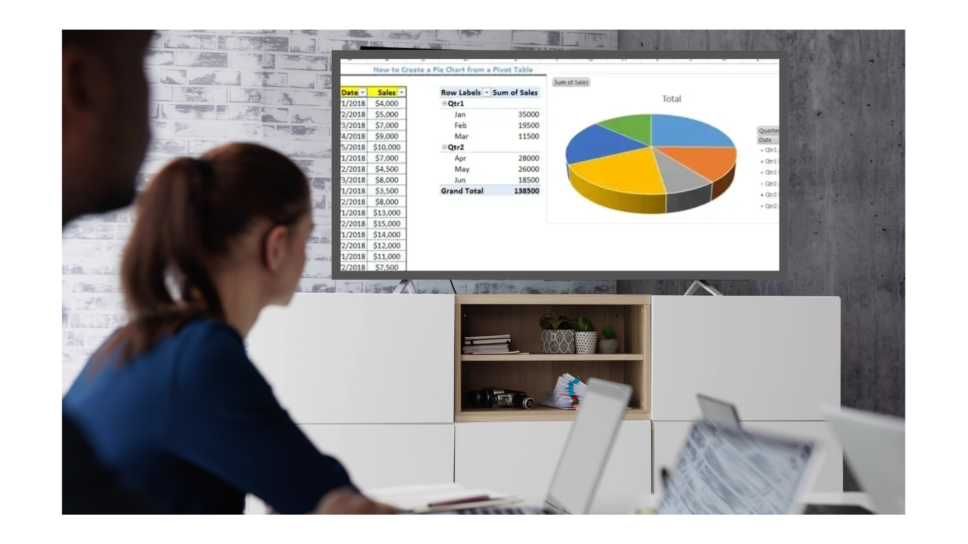
Incorporate Pivot Tables and Charts
Pivot tables allow for quick data summarization, while pivot charts provide a visual representation. Combining these features in your Excel dashboard can streamline the process of data analysis and visualization.
Automate Data Refresh
Set up your Excel file to automatically refresh data from connected sources. This automation minimizes manual intervention and ensures that the dashboard always reflects the most current information.
Embed Interactive Elements
Interactive elements, such as slicers or drop-down menus, give users the ability to filter data and view different segments. This feature enhances the user experience and makes the dashboard a valuable tool for deeper analysis.
Executive Insights from Metrics on TV
Office TV dashboards not only serve as a tool for monitoring performance; they also play a critical role in driving strategic decisions. Here are some ways executives can derive insights from the metrics displayed:
Quick Identification of Trends
By regularly reviewing live data, executives can detect emerging trends early. Whether it is an unexpected surge in website traffic or a gradual decline in customer satisfaction, these insights can prompt timely interventions.
Focused Decision Making
When the most relevant KPIs are clearly displayed, decision makers can focus on key areas that need attention. This focus reduces the noise of irrelevant data and directs attention to actionable insights, facilitating more efficient meetings and planning sessions.
Resource Reallocation
If certain metrics reveal inefficiencies—for example, a low project completion rate or high customer acquisition costs—leaders can adjust resource allocation. By redirecting efforts and budget to critical areas, the overall performance of the company can improve significantly.
Encouraging Accountability
Publicly displaying metrics in a shared office space fosters a sense of accountability among teams. When everyone sees how their department contributes to the overall business performance, there is a natural incentive to perform at their best.
Bringing It All Together with RocketScreens
RocketScreens provides an easy way to connect your Excel KPI displays to office TV dashboards. By integrating your existing data streams into a secure digital signage platform, you can ensure that everyone in the office has access to current and actionable information.
- Streamlined Integration: RocketScreens makes it simple to set up your dashboard by connecting to your Excel files and automatically updating them with fresh data.
- User-Friendly Interface: The platform offers a straightforward interface that can be customized to meet the specific needs of your business, making it easier for executives and teams to view and interpret data.
- Cross-Application Connectivity: With over 100 integrations, RocketScreens ensures that your office KPI dashboards are always in sync with other critical business applications. This interconnected system enhances the overall efficiency of your reporting and decision-making processes.
- Secure Data Display: The platform guarantees secure transmission of data, ensuring that sensitive business metrics remain protected while still being accessible for real-time decision-making.
This approach helps in maintaining transparency and consistency across the organization, ultimately supporting a data-driven culture where every employee is informed about the company’s performance.
Final Thoughts
An effective office TV dashboard is more than just a display of numbers—it is a strategic asset that drives engagement and informs leadership. By carefully selecting KPIs, choosing the right visualization types, and leveraging real-time data from Excel KPI displays, organizations can create a dynamic tool for monitoring performance. The ten essential KPIs discussed above offer a comprehensive view of business health, from sales revenue and profit margins to customer satisfaction and operational efficiency.
Integrating these metrics into a digital signage solution like RocketScreens ensures that data is not only visually compelling but also readily available wherever it’s needed. The combination of an intuitive Excel dashboard with a secure and flexible platform enables businesses to maintain clarity, drive accountability, and make informed decisions quickly.
For businesses aiming to create a culture of transparency and continuous improvement, displaying key metrics on office TV dashboards is a step toward smarter management. With clear and accessible data, executives can lead with confidence, teams can collaborate more effectively, and overall performance can steadily improve.
In this guide, we have explored the process of selecting the right KPIs, illustrated how different visualization techniques can make these metrics more accessible, and demonstrated the tangible benefits of integrating your Excel KPI display with a digital signage platform. Whether you are tracking sales, monitoring employee productivity, or analyzing customer feedback, the right data displayed in the right way can empower your organization to reach new heights.
By adopting these strategies, you ensure that your office remains a hub of real-time insights and informed decision-making. Consider upgrading your current display system by integrating with RocketScreens—your partner in delivering powerful, secure, and flexible digital signage solutions that connect your data across multiple platforms.