Monday.com dashboards are an effective way to keep teams informed and motivated by displaying real-time data. When you integrate key performance indicators (KPIs), productivity metrics, and visual data hierarchies onto an office TV, every team member can see progress at a glance. In this guide, we explore the top 10 Monday.com metrics that matter and explain how to set up a dashboard to maximize team performance. We also discuss how RocketScreens’ digital signage platform can seamlessly integrate with Monday.com, providing a secure and versatile way to share these critical insights across your workspace.
In today’s fast-paced work environment, having immediate access to data is essential. By displaying Monday.com important metrics on a TV dashboard, your team can align on goals, monitor productivity, and quickly adjust to changing priorities. Let’s break down the top metrics that will keep everyone informed and focused on achieving high performance.
1. Overall Project Progress
What It Is
Overall project progress is a high-level metric that aggregates the completion status of tasks, subtasks, and milestones across one or several boards. It typically shows a percentage value representing how much work has been completed relative to the total work planned.
Why It Matters
Displaying overall project progress on a TV dashboard gives every team member a snapshot of how projects are advancing. This metric helps identify whether projects are on schedule and pinpoints potential delays before they become critical issues.
How to Measure on Monday.com
Widgets & Boards: Use Monday.com’s progress tracking widget or create a formula column that calculates the completion percentage of tasks.
Visualization: Choose a circular progress chart or bar graph to clearly indicate progress.
Tips for Effective Use
Set Milestones: Break down the project into smaller milestones to provide more granular insights.
Real-Time Updates: Ensure your dashboard refreshes frequently so that the displayed percentage is always current.
2. Task Completion Rate
What It Is
The task completion rate shows the number of tasks completed within a given timeframe versus the total number of tasks assigned. It is a valuable productivity metric that helps teams see how effectively they are moving through their daily workload.
Why It Matters
A high completion rate reflects a productive team while a lower rate might signal process inefficiencies or bottlenecks. Displaying this metric on an office TV dashboard serves as a motivator and provides transparency in performance across the team.
How to Measure on Monday.com
Calculation: Divide the number of completed tasks by the total tasks in progress over a defined period, then multiply by 100 to obtain a percentage.
Widgets: Use Monday.com’s Numbers widget to display the completion rate dynamically.
Tips for Effective Use
Set Daily/Weekly Targets: Use these targets to compare against the real-time data and adjust workloads accordingly.
Filter by Department: If your board has multiple teams or departments, consider filtering the completion rate to see performance across different segments.
3. Upcoming Deadlines and Milestone Alerts
What It Is
This metric identifies approaching deadlines and milestones. It can highlight tasks or projects that are near their due date, ensuring that important dates are not overlooked.
Why It Matters
Visual reminders of upcoming deadlines help maintain urgency and encourage teams to prioritize high-impact work. It’s especially valuable in dynamic environments where shifting priorities are common.
How to Measure on Monday.com
Deadline Column: Use the Date column to mark deadlines for each task.
Automations: Set up notifications or automations that flag items nearing their due date.
Visualization: A countdown widget or a calendar view can be embedded on the dashboard to display upcoming dates.
Tips for Effective Use
Regularly Update Dates: Ensure that due dates are accurate and regularly updated as projects evolve.
Combine with Prioritization: Pair deadline data with task priority levels to quickly identify critical items.
4. Team Workload Distribution
What It Is
Team workload distribution shows how tasks are assigned among team members. It provides a visual representation of who is working on what, ensuring that workloads are balanced.
Why It Matters
A balanced workload is key to preventing burnout and ensuring that no single team member is overburdened. When displayed on a TV dashboard, this metric helps managers redistribute tasks proactively.
How to Measure on Monday.com
Workload Widget: Monday.com offers a Workload widget that summarizes tasks assigned to each team member.
Custom Columns: Use the People column to track assignments and generate reports that indicate the number of tasks per team member.
Visualization: Pie charts or bar graphs can effectively display this data.
Tips for Effective Use
Regular Reviews: Use the dashboard data during stand-ups or weekly meetings to discuss redistributing work if necessary.
Set Thresholds: Establish workload thresholds to quickly identify when someone might be overloaded.
5. High-Priority Issues and Bottlenecks
What It Is
This metric focuses on high-priority issues that require immediate attention. It can include tasks that are blocked, delayed, or flagged as urgent.
Why It Matters
Identifying bottlenecks early helps teams address problems before they escalate. A TV dashboard that highlights high-priority issues keeps everyone aware of potential delays and fosters a proactive problem-solving approach.
How to Measure on Monday.com
Status Columns: Use status columns to tag tasks as “Blocked” or “Urgent.”
Filters & Views: Create custom views that show only tasks with high-priority labels.
Visualization: A dedicated widget or color-coded list can display these issues prominently.
Tips for Effective Use
Daily Standups: Use this metric to drive discussions during daily meetings and address obstacles immediately.
Assign Ownership: Ensure that each high-priority item has an assigned owner to guarantee accountability.
6. Custom KPIs for Project-Specific Goals
What It Is
Custom KPIs are metrics tailored to the unique objectives of your projects. These might include specific targets like customer response time, bug resolution rate, or feature release frequency.
Why It Matters
Different projects have different goals. Custom KPIs provide meaningful insights that standard metrics might not capture. Displaying them on an office TV dashboard helps teams focus on what matters most for their particular project.
How to Measure on Monday.com
Formula Columns: Create custom formulas that calculate KPIs based on your project’s data.
Dashboards: Combine multiple widgets to provide an aggregated view of these metrics.
Visualization: Use line charts or gauge widgets to track progress against custom targets.
Tips for Effective Use
Align with Goals: Make sure that your custom KPIs are directly tied to your project objectives.
Review and Adjust: Regularly evaluate whether these KPIs remain relevant as project priorities evolve.
7. Real-Time Data Refresh and Accuracy
What It Is
This metric isn’t about a specific figure but rather about the integrity and freshness of your data. It measures how frequently your Monday.com dashboard updates its metrics.
Why It Matters
Real-time accuracy is essential for decision-making. Outdated information can lead to misinterpretations and delayed responses. When displayed on an office TV, up-to-date data keeps everyone in sync.
How to Measure on Monday.com
Automations & Integrations: Set up automations that refresh data at regular intervals.
Dashboard Settings: Configure your dashboard’s refresh rate to ensure data is current.
Visualization: Include a timestamp on the dashboard that shows the last update time.
Tips for Effective Use
Monitor Update Frequency: Regularly check that the data refresh intervals are meeting your operational needs.
Combine with Alerts: Pair real-time data with automated alerts to notify teams when data updates or anomalies occur.
8. Cycle Time and Throughput
What It Is
Cycle time measures the duration from when work begins on a task until it is completed, while throughput counts the number of tasks finished over a certain period. Together, they provide insight into the speed and efficiency of your workflow.
Why It Matters
Monitoring cycle time and throughput is critical for understanding how quickly a team can complete work and identify process inefficiencies. Displaying these metrics on a TV dashboard can help teams fine-tune their processes and improve productivity.
How to Measure on Monday.com
Time Tracking: Use time tracking columns to record start and finish times for tasks.
Formulas: Create formula columns to calculate cycle time.
Widgets: Visualize throughput with bar charts or line graphs that show the number of tasks completed per day or week.
Tips for Effective Use
Benchmarking: Compare current cycle times and throughput with historical data to identify trends.
Process Improvement: Use these metrics as a baseline to test and implement process improvements.
Encourage Transparency: Share these metrics openly to foster a culture of continuous improvement.
9. Employee Satisfaction and Team Morale
What It Is
Employee satisfaction and team morale are qualitative measures that gauge the overall well-being and engagement of your team members. They can be measured via surveys or by tracking feedback submitted through Monday.com.
Why It Matters
A happy team is more likely to be productive and creative. When team morale is high, everyone is motivated to perform at their best. Displaying these insights on a TV dashboard emphasizes that the organization values its people, and it helps managers address any emerging issues promptly.
How to Measure on Monday.com
Survey Integrations: Integrate survey tools with Monday.com to collect feedback.
Feedback Columns: Use status or text columns for quick pulse checks.
Visualization: Use gauge charts or simple summary widgets to display satisfaction scores.
Tips for Effective Use
Regular Pulse Checks: Conduct brief, regular surveys and update the dashboard with the results.
Action Plans: Use the feedback to inform team discussions and implement improvement plans.
Celebrate Success: Recognize high morale as a key achievement and use it to reinforce positive behaviors.
10. ROI and Business Impact Metrics
What It Is
Return on investment (ROI) and other business impact metrics measure how well projects and initiatives are translating into tangible business outcomes, such as revenue growth, cost savings, or market expansion.
Why It Matters
Ultimately, every project should contribute to the company’s bottom line. By tracking ROI and related metrics on your dashboard, you ensure that every effort is aligned with strategic business goals. These metrics help bridge the gap between operational work and overall business success.
How to Measure on Monday.com
Integration with Financial Data: Connect your Monday.com boards with your accounting or CRM software.
Custom Formula Columns: Create formulas that calculate ROI based on project costs and revenue gains.
Visualization: Use a Numbers widget or a combination of charts to display ROI trends over time.
Tips for Effective Use
Regular Updates: Keep your financial data integrations current to ensure accuracy.
Benchmarking: Compare current ROI figures with historical data or industry benchmarks.
Communication: Share these metrics with key stakeholders to align on long-term business strategies.
How to Build an Effective Monday.com TV Dashboard
Once you’ve identified which metrics matter most, the next step is to build an effective Monday.com TV dashboard that displays them in a clear, engaging way. Here are some best practices:
1. Plan Your Visual Hierarchy
Prioritize Key Metrics: Place the most critical metrics at the top or in the center of your dashboard. For example, overall project progress and task completion rate should be prominently displayed.
Group Related Metrics: Cluster similar data together—such as workflow metrics (cycle time and throughput) or team performance metrics (workload distribution and employee satisfaction)—to help viewers easily interpret the information.
2. Choose the Right Widgets
Monday.com provides a variety of widgets to suit different types of data. Some recommendations include:
Numbers Widget: For displaying key percentages and totals.
Chart Widget: To create bar or line charts that show trends over time.
Calendar Widget: For highlighting upcoming deadlines and milestones.
Countdown Widget: To visually emphasize tasks that are nearing their due dates.
3. Ensure Real-Time Data Accuracy
A dashboard is only useful if the data is current. Set up automations and integrations that refresh your metrics regularly, ensuring that the displayed numbers are always up to date. Include a timestamp on the dashboard so team members know when the data was last refreshed.
4. Use Clear and Simple Design
Avoid clutter by using a clean design. Keep text concise and use color-coding to differentiate between statuses (for example, green for on track, amber for caution, and red for issues). Ensure that font sizes are legible from a distance, especially if the dashboard is displayed on a large TV screen.
5. Test the Layout in Your Workspace
Before finalizing your dashboard, test it on the actual TV screen where it will be displayed. Verify that all elements are visible and that the layout is intuitive. Collect feedback from team members and make adjustments as needed.
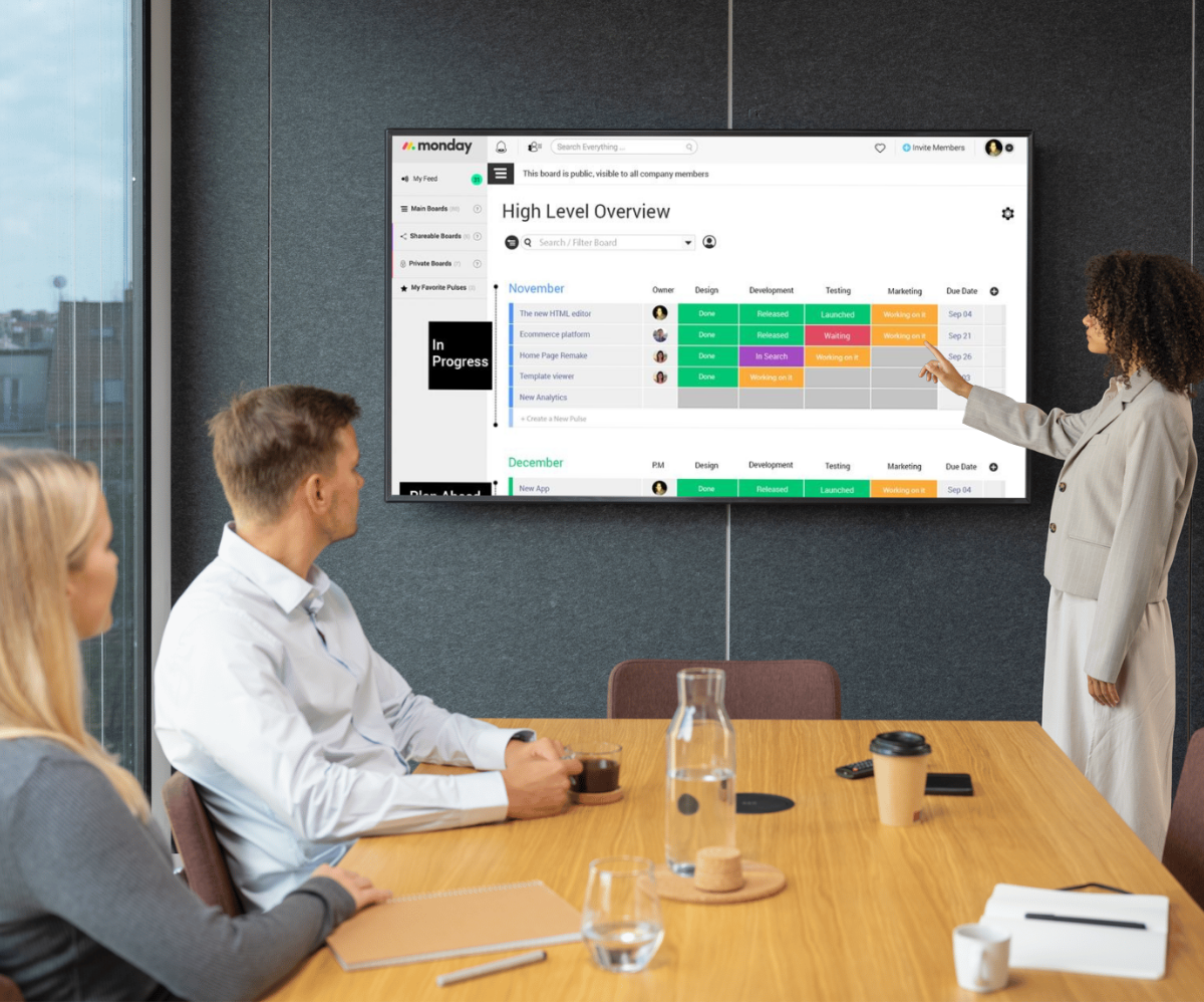
RocketScreens: Enhancing Your Dashboard Display
While Monday.com provides robust tools to build effective dashboards, the final step is to display them seamlessly in your office environment. This is where RocketScreens comes in.
What is RocketScreens?
RocketScreens is a digital signage platform that securely connects with over 100 applications, including Monday.com, to display your powerful data anywhere. Whether you’re using it in a conference room, lobby, or office floor, RocketScreens makes it easy to share real-time metrics with your team.
Why Use RocketScreens?
Seamless Integration: RocketScreens connects directly with Monday.com dashboards, ensuring your data is always up to date.
Easy Setup: With a simple, user-friendly interface, you can display your dashboards on any screen with minimal setup.
Customizable Display Options: Tailor the look and feel of your digital signage to match your company’s branding.
Secure Connection: Data is transmitted securely, so you can be confident that sensitive information is protected.
Versatile Applications: Use RocketScreens not only for project management metrics but also for marketing dashboards, sales KPIs, and more.
How to Integrate RocketScreens with Monday.com
Connect Your Accounts: Use RocketScreens’ integration features to link your Monday.com account.
Select Your Dashboard: Choose the dashboard you want to display. Whether it’s the overall project progress, task completion rate, or any other metric, you can display multiple dashboards in rotation.
Customize the View: Adjust display settings such as refresh intervals, layout, and design elements to suit your office environment.
Deploy: Once set up, the dashboard will automatically update in real time on your office TV, ensuring everyone sees the most current data.
RocketScreens complements your Monday.com setup perfectly by transforming static dashboards into dynamic displays that keep teams motivated and informed.
Best Practices for Using Your TV Dashboard in the Office
Engage Your Team
Display the dashboard in a high-traffic area so that every team member can easily see the metrics. Use the data during meetings to discuss progress, address challenges, and celebrate successes.
Set Regular Review Meetings
Schedule daily or weekly check-ins to review the dashboard metrics. Use these meetings to identify issues, plan improvements, and align on priorities.
Encourage Transparency and Accountability
A shared dashboard fosters a sense of accountability. When everyone can see the progress and challenges in real time, it motivates team members to stay focused and work collaboratively.
Use the Data to Drive Improvements
Let the metrics guide your process improvements. If cycle times are increasing or if high-priority issues are flagged consistently, use these insights to revise workflows, redistribute workloads, or adjust deadlines.
Celebrate Successes
Highlight and celebrate when key milestones are reached. A quick glance at the dashboard can reinforce a positive team culture and encourage continuous improvement.
Conclusion
Displaying Monday.com important metrics on your office TV dashboard is more than just a trend—it’s a practical way to drive transparency, collaboration, and productivity. By focusing on the top 10 metrics, including overall project progress, task completion rate, upcoming deadlines, workload distribution, and more, you create an environment where every team member stays aligned with the organization’s goals.
Using clear visual hierarchies, the right widgets, and ensuring data is refreshed in real time, you can build a dashboard that not only informs but also motivates your team. Moreover, with RocketScreens’ digital signage integration, your Monday.com dashboards can be easily displayed on large screens throughout your office, ensuring that the most critical information is always visible to the team.
By combining these powerful metrics with regular reviews and team engagement, you lay the foundation for continuous improvement. Whether you’re managing projects, tracking sales KPIs, or monitoring marketing campaigns, the best Monday.com TV metrics empower your team to act swiftly and make data-driven decisions.
Get started today by setting up your Monday.com dashboards and exploring RocketScreens’ seamless integration—transform your office space into a hub of real-time information that drives success and keeps everyone on the same page.